

Typography is the leading visual pillar of the Mobi Lab brand. It carries the most significant load of our brand’s look and feel. Therefore, we wrote the following rules to accomplish a coherent experience across all mediums.
We use the Graphik type family as our corporate typeface. We use it everywhere, from invoices to websites.

Graphik comes in multiple weights, but we use only regular and semibold. The equivalent on the web is 400 and 600 weights.
Graphik comes in multiple weights, but we use only regular and semibold. The equivalent on the web is 400 and 600 weights.


Graphik comes in multiple weights, but we use only regular and semibold. The equivalent on the web is 400 and 600 weights.


We use type size and weight contrast to dramatise the visual hierarchy. The contrast shows our confidence in type design and dovetails with our brand attributes (Feeling).

The dramatic size differences between headings and body text establish our confident look for visuals.
The dramatic size differences between headings and body text establish our confident look for visuals.


The dramatic size differences between headings and body text establish our confident look for visuals.

Use Graphik Semibold when you want to highlight (as some say, “make it bold”) some of your content.
Use Graphik Semibold when you want to highlight (as some say, “make it bold”) some of your content.


Use Graphik Semibold when you want to highlight (as some say, “make it bold”) some of your content.


We know the users don’t like reading long bodies of text. To mitigate it, we like to use one word or short headings in front of a paragraph. The headings contextualise or summarise the paragraph.

The size ratio between headline and contextual heading is roughly 1:3.6
The size ratio between headline and contextual heading is roughly 1:3.6


The size ratio between headline and contextual heading is roughly 1:3.6

The size ratio between body text and contextual heading is roughly 1:1.8
The size ratio between body text and contextual heading is roughly 1:1.8


The size ratio between body text and contextual heading is roughly 1:1.8


There are certain symbols we use to diversify our content visual look & feel.

We use the ampersand (&) symbol in short informal titles to shorten the lines. But we do not use the ampersand in text paragraphs.
We use the ampersand (&) symbol in short informal titles to shorten the lines. But we do not use the ampersand in text paragraphs.


We use the ampersand (&) symbol in short informal titles to shorten the lines. But we do not use the ampersand in text paragraphs.

Size matters! This is a hyphen (-), this is an en dash (–), and this is an em dash (—). One is longer than the other. We prefer the longest because it is the most versatile. We use the em dash (⇧+⌥+-) in place of a colon when we want to emphasise the conclusion.
Size matters! This is a hyphen (-), this is an en dash (–), and this is an em dash (—). One is longer than the other. We prefer the longest because it is the most versatile. We use the em dash (⇧+⌥+-) in place of a colon when we want to emphasise the conclusion.


Size matters! This is a hyphen (-), this is an en dash (–), and this is an em dash (—). One is longer than the other. We prefer the longest because it is the most versatile. We use the em dash (⇧+⌥+-) in place of a colon when we want to emphasise the conclusion.

We use the em dash symbol (U+2014) instead of the bullet symbol (U+2022) to introduce items in a list.
We use the em dash symbol (U+2014) instead of the bullet symbol (U+2022) to introduce items in a list.


We use the em dash symbol (U+2014) instead of the bullet symbol (U+2022) to introduce items in a list.


We cannot embed the corporate typeface on Google products like Slides or Docs. So instead, we use Montserrat as an alternative typeface.
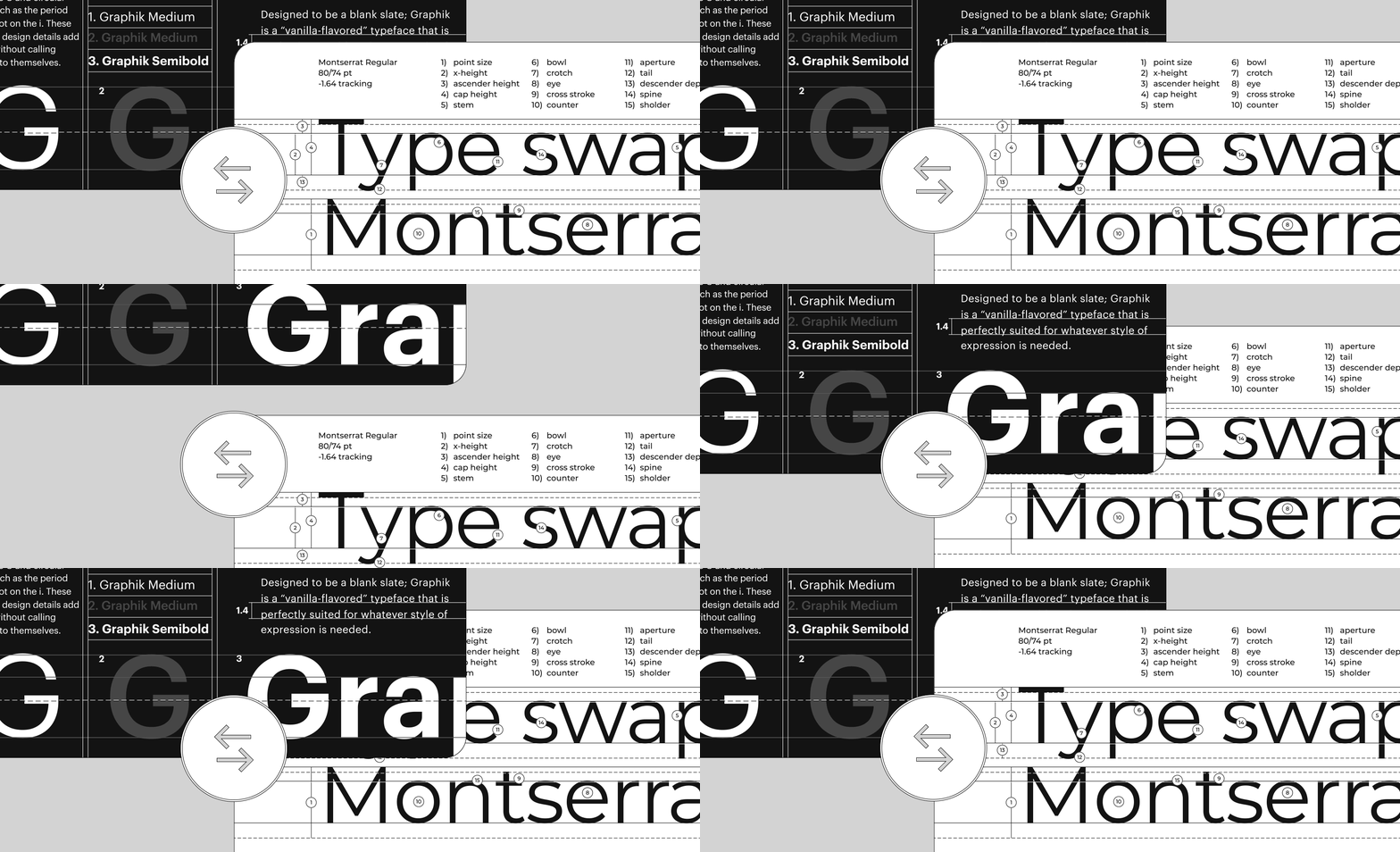
Alternatively, we use Montserrat Regular for body and Montserrat Semi-bold for highlighted text.
Alternatively, we use Montserrat Regular for body and Montserrat Semi-bold for highlighted text.


Alternatively, we use Montserrat Regular for body and Montserrat Semi-bold for highlighted text.


Follow the "keep it simple stupid" rule when in need to draw the readers' attention to some content.

Please use semibold type weight when highlighting the text.
Please use semibold type weight when highlighting the text.


Please use semibold type weight when highlighting the text.
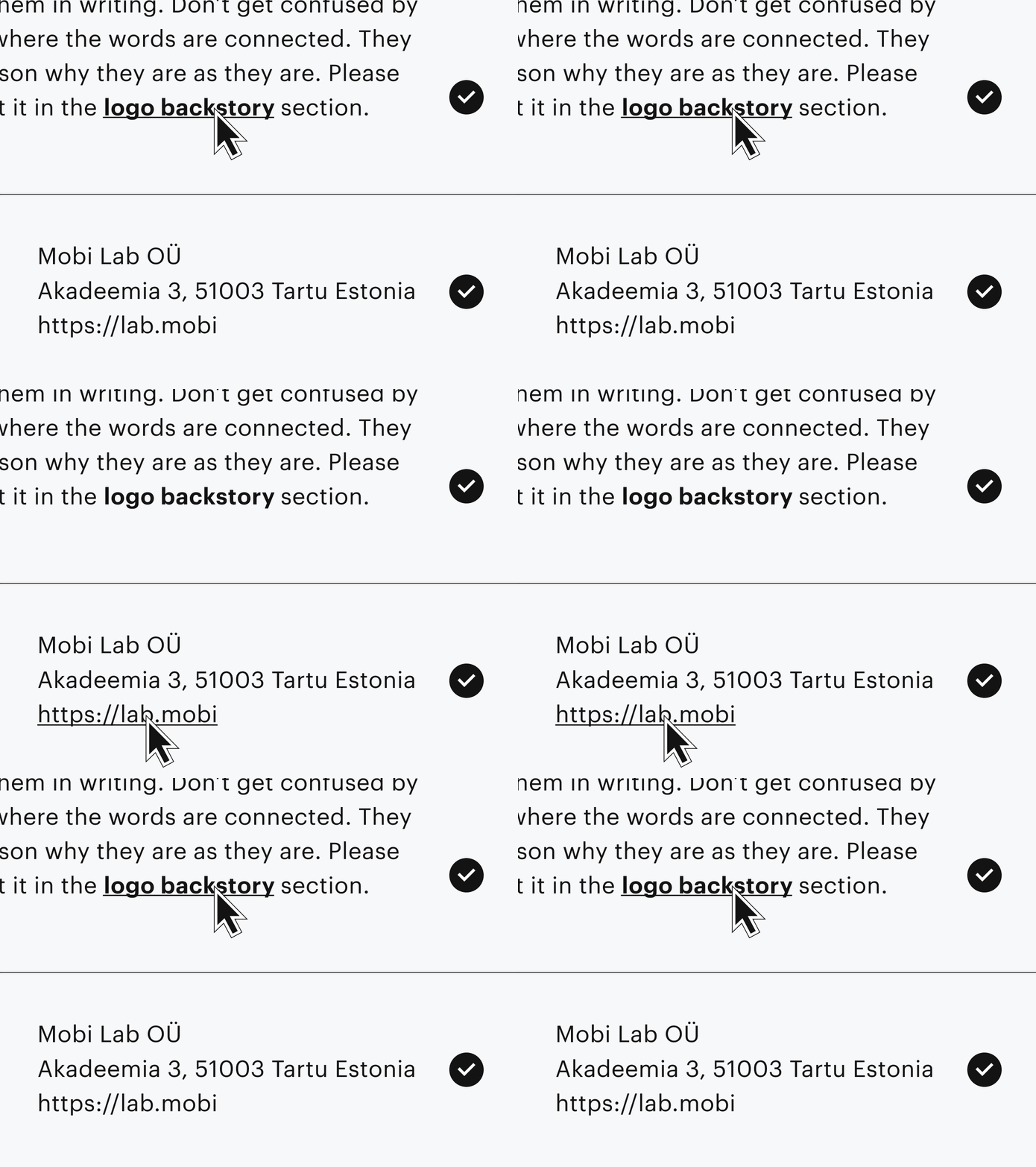
Please present embedded links with semibold weight for the default state and underlined for the hover state. Keep the standalone URL links in regular weight.
Please present embedded links with semibold weight for the default state and underlined for the hover state. Keep the standalone URL links in regular weight.


Please present embedded links with semibold weight for the default state and underlined for the hover state. Keep the standalone URL links in regular weight.


We highly suggest some approaches.
.svg)
Do use sentence case for headlines. That is, capitalise only the first letter of the first word in the title. Same way as you would write a sentence.
Do use sentence case for headlines. That is, capitalise only the first letter of the first word in the title. Same way as you would write a sentence.
.svg)
.svg)
Do use sentence case for headlines. That is, capitalise only the first letter of the first word in the title. Same way as you would write a sentence.

Inspired by International Typographic Style, we align all text content flush left, ragged right.
Inspired by International Typographic Style, we align all text content flush left, ragged right.


Inspired by International Typographic Style, we align all text content flush left, ragged right.


We take it very personally when you mess around with our appearance. To avoid the repercussions, please avoid the following pitfalls.

Don't hue the text to highlight it — no need to exaggerate. Instead, increase only text weight (regular → semibold).
Don't hue the text to highlight it — no need to exaggerate. Instead, increase only text weight (regular → semibold).


Don't hue the text to highlight it — no need to exaggerate. Instead, increase only text weight (regular → semibold).

Don’t use the corporate typeface without copyrights.
Don’t use the corporate typeface without copyrights.


Don’t use the corporate typeface without copyrights.


We might use a lot of typography-related terminologies. But, no worries, here is a cheat sheet.
The inside of a narrow angle where two strokes in character meet, as in V, W, Y.
The inside of a narrow angle where two strokes in character meet, as in V, W, Y.
The inside of a narrow angle where two strokes in character meet, as in V, W, Y.
The spot where a stroke joins a stem.
The spot where a stroke joins a stem.
The spot where a stroke joins a stem.
The (standard) upright type style. The term Roman is also sometimes used to denote Regular weight.
The (standard) upright type style. The term Roman is also sometimes used to denote Regular weight.
The (standard) upright type style. The term Roman is also sometimes used to denote Regular weight.
Adding space between sequences of characters, as opposed to kerning, which only adds space between a pair of characters.
Adding space between sequences of characters, as opposed to kerning, which only adds space between a pair of characters.
Adding space between sequences of characters, as opposed to kerning, which only adds space between a pair of characters.
Although typeface and font are often used interchangeably, typeface refers to the design (what you see on the screen), while font refers to the physical embodiment (file what you use).
Although typeface and font are often used interchangeably, typeface refers to the design (what you see on the screen), while font refers to the physical embodiment (file what you use).
Although typeface and font are often used interchangeably, typeface refers to the design (what you see on the screen), while font refers to the physical embodiment (file what you use).
