

Here you can read when to use what logo and download the packages. Each download includes approved formats and colour options.

Mobi Lab's primary logo is the most recognisable brand asset, and we are using it on websites, presentations, print materials, and all outwards facing content.
Mobi Lab's primary logo is the most recognisable brand asset, and we are using it on websites, presentations, print materials, and all outwards facing content.


Mobi Lab's primary logo is the most recognisable brand asset, and we are using it on websites, presentations, print materials, and all outwards facing content.


Alternative lockup is used only as an avatar image on third-party services profiles because the square-shaped logo feels visually more significant in tiny spaces.
Alternative lockup is used only as an avatar image on third-party services profiles because the square-shaped logo feels visually more significant in tiny spaces.


Alternative lockup is used only as an avatar image on third-party services profiles because the square-shaped logo feels visually more significant in tiny spaces.


Apparently, the bulging bubble from the letter “b” is significant and represents two things.

First of all, this doohickey is a dot used to formulate URLs. Like lab.mobi or design.lab.mobi or even s.lab.mobi. If you rearrange the words in the logo, you will form our website hyperlink. Read more about it under the Hashtags page.
First of all, this doohickey is a dot used to formulate URLs. Like lab.mobi or design.lab.mobi or even s.lab.mobi. If you rearrange the words in the logo, you will form our website hyperlink. Read more about it under the Hashtags page.


First of all, this doohickey is a dot used to formulate URLs. Like lab.mobi or design.lab.mobi or even s.lab.mobi. If you rearrange the words in the logo, you will form our website hyperlink. Read more about it under the Hashtags page.

Secondly, this doodah represents all our creations delivered to the users, created by our excellent people. Hence the bubble protrudes from the letter “b”. You may ask why from the letter “b”? Read the other part of this section for the answer.
Secondly, this doodah represents all our creations delivered to the users, created by our excellent people. Hence the bubble protrudes from the letter “b”. You may ask why from the letter “b”? Read the other part of this section for the answer.


Secondly, this doodah represents all our creations delivered to the users, created by our excellent people. Hence the bubble protrudes from the letter “b”. You may ask why from the letter “b”? Read the other part of this section for the answer.


A minimum safe area prevents unwanted junk from entering the logo's personal space, maximising the visual read.

The primary logo safe area derives from the dimensions of the Mobi Lab logotype letter O.
The primary logo safe area derives from the dimensions of the Mobi Lab logotype letter O.


The primary logo safe area derives from the dimensions of the Mobi Lab logotype letter O.

The alternative logo safe area on the left and the right side derives from the dimensions of the Mobi Lab logotype letter O. The logo lockup aligns to the centre of the square.
The alternative logo safe area on the left and the right side derives from the dimensions of the Mobi Lab logotype letter O. The logo lockup aligns to the centre of the square.


The alternative logo safe area on the left and the right side derives from the dimensions of the Mobi Lab logotype letter O. The logo lockup aligns to the centre of the square.


There are no limits when you want to go large, but to ensure the element is visible in tiny sizes, please keep in mind the following.

The minimum size of the logo on the digital screens should not be smaller than 50px width @1x.
The minimum size of the logo on the digital screens should not be smaller than 50px width @1x.


The minimum size of the logo on the digital screens should not be smaller than 50px width @1x.

On paper and print, the logo width needs to be wider than 20mm.
On paper and print, the logo width needs to be wider than 20mm.


On paper and print, the logo width needs to be wider than 20mm.


We highly suggest some approaches.

Do present the logo in a modest manner. Think about our logo as a classy gentleman who’s radiating confidence. Meaning a subtle logo in the corner of the layout is enough.
Do present the logo in a modest manner. Think about our logo as a classy gentleman who’s radiating confidence. Meaning a subtle logo in the corner of the layout is enough.


Do present the logo in a modest manner. Think about our logo as a classy gentleman who’s radiating confidence. Meaning a subtle logo in the corner of the layout is enough.

Do ensure the logo is equal in size to neighbouring icons. Maintain its shape and proportions and provide clear space between the logos.
Do ensure the logo is equal in size to neighbouring icons. Maintain its shape and proportions and provide clear space between the logos.


Do ensure the logo is equal in size to neighbouring icons. Maintain its shape and proportions and provide clear space between the logos.

Do use the logo in positive or negative, according to the use case.
Do use the logo in positive or negative, according to the use case.


Do use the logo in positive or negative, according to the use case.


We take it very personally when you mess around with our appearance. To avoid the repercussions, please avoid the following pitfalls.

Don’t use any other colour besides black. The only exception is the white logo on a dark theme.
Don’t use any other colour besides black. The only exception is the white logo on a dark theme.


Don’t use any other colour besides black. The only exception is the white logo on a dark theme.

Don't use our legacy logo, with black and orange colours anymore.
Don't use our legacy logo, with black and orange colours anymore.


Don't use our legacy logo, with black and orange colours anymore.

When you misuse the contrast, expect us to explain the fundamentals of the contrast through an explosion of a flash grenade. You need to meet the minimum contrast ratio of 8:1.
When you misuse the contrast, expect us to explain the fundamentals of the contrast through an explosion of a flash grenade. You need to meet the minimum contrast ratio of 8:1.


When you misuse the contrast, expect us to explain the fundamentals of the contrast through an explosion of a flash grenade. You need to meet the minimum contrast ratio of 8:1.
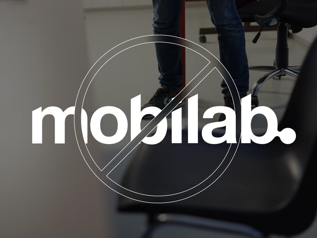
Don’t use the logo on top of an image. Instead, do so, and we’ll ensure you don’t fit in our family photo anymore.
Don’t use the logo on top of an image. Instead, do so, and we’ll ensure you don’t fit in our family photo anymore.


Don’t use the logo on top of an image. Instead, do so, and we’ll ensure you don’t fit in our family photo anymore.

Don’t f*ck up the proportion constraints of the logo, or we will start adjusting your body proportions.
Don’t f*ck up the proportion constraints of the logo, or we will start adjusting your body proportions.


Don’t f*ck up the proportion constraints of the logo, or we will start adjusting your body proportions.
