

Mobi Lab brand primarily utilises typography to establish visual aesthetics. We use icons only to illustrate and support the text content.
Historically we have followed the outlined icon style.
Use hairline thickness for the icons and black stroke colour. Feel free to adjust the shade's hue according to the project theme.
Use hairline thickness for the icons and black stroke colour. Feel free to adjust the shade's hue according to the project theme.
Use hairline thickness for the icons and black stroke colour. Feel free to adjust the shade's hue according to the project theme.


There is one special icon we use throughout all of our designs — the arrow.
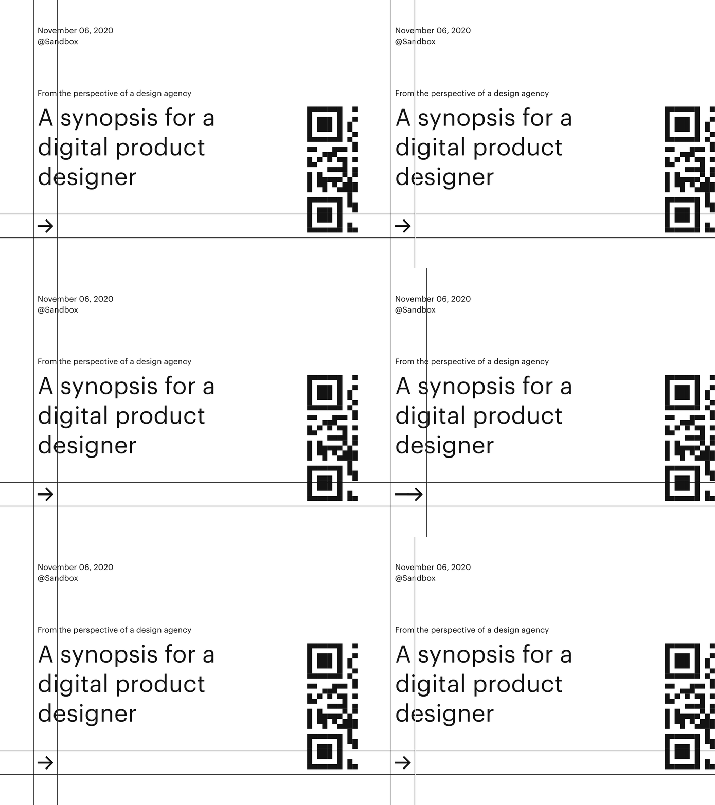
When we want to emphasise some content, we point the arrow towards it. Usually, a title text is next to the arrow. Sometimes the arrow is animated to bounce.
When we want to emphasise some content, we point the arrow towards it. Usually, a title text is next to the arrow. Sometimes the arrow is animated to bounce.


When we want to emphasise some content, we point the arrow towards it. Usually, a title text is next to the arrow. Sometimes the arrow is animated to bounce.
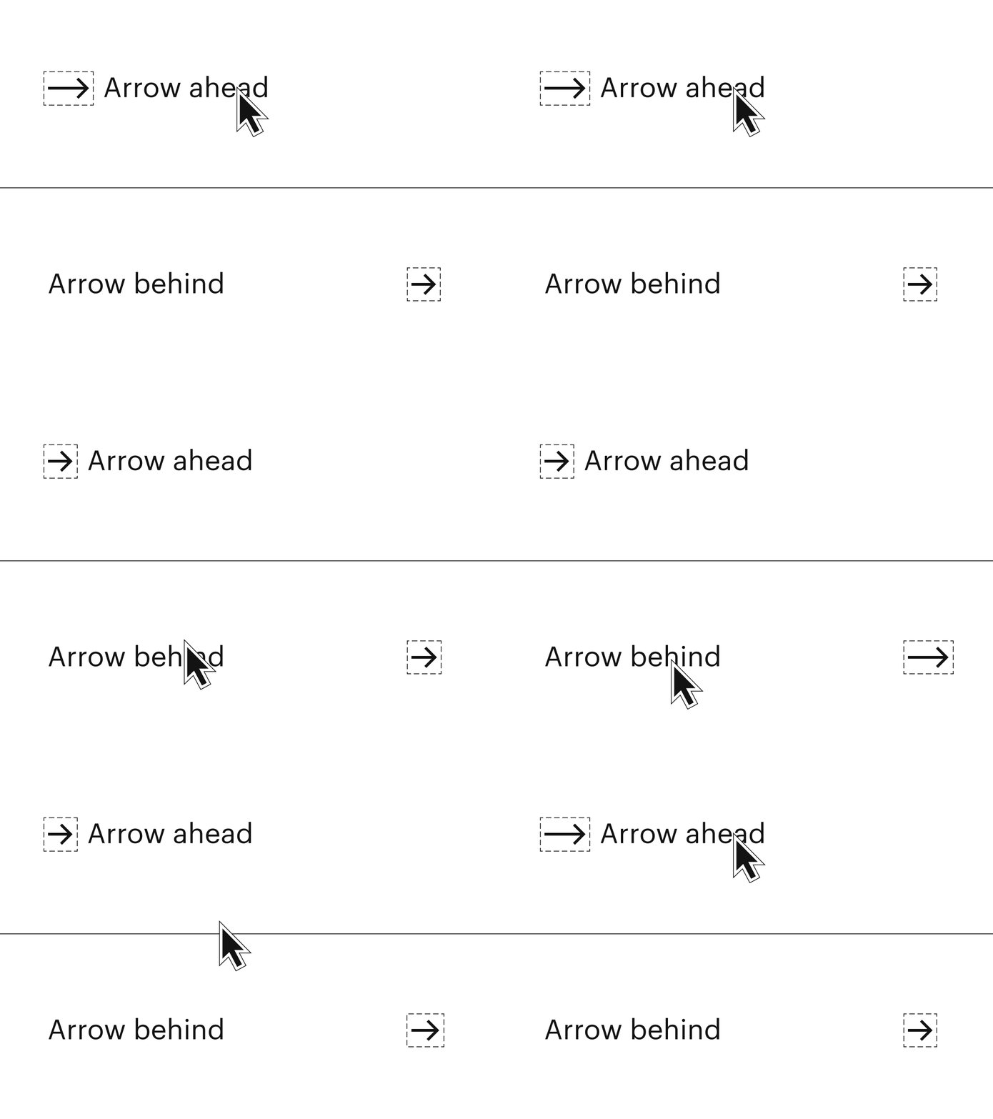
Arrow, together with the call-to-action text, creates an interactive button. Feel free to use the arrow in front or end of the text.
Arrow, together with the call-to-action text, creates an interactive button. Feel free to use the arrow in front or end of the text.


Arrow, together with the call-to-action text, creates an interactive button. Feel free to use the arrow in front or end of the text.

With interactive list items, the arrow aligns on the right and the text on the left.
With interactive list items, the arrow aligns on the right and the text on the left.


With interactive list items, the arrow aligns on the right and the text on the left.


Illustrations help convey complex ideas. Therefore, they should be relevant and reflect context.

We don’t follow a specific illustration style because typography and layout design is our primary pillars for Mobi Lab's visual style. Instead, we value well-established artists' creations and outsource the job when needed.
We don’t follow a specific illustration style because typography and layout design is our primary pillars for Mobi Lab's visual style. Instead, we value well-established artists' creations and outsource the job when needed.


We don’t follow a specific illustration style because typography and layout design is our primary pillars for Mobi Lab's visual style. Instead, we value well-established artists' creations and outsource the job when needed.


We use thin lines to separate content — for example, between list items or for text fields.

We use the light and thin separator lines on the invoice and offer tables.
We use the light and thin separator lines on the invoice and offer tables.


We use the light and thin separator lines on the invoice and offer tables.

Use also a thin line to separate list items.
Use also a thin line to separate list items.


Use also a thin line to separate list items.
