

Colour distinguishes our brand and helps us create consistent experiences across products and support legibility by ensuring sufficient colour contrast between elements.
Mobi Lab brand utilises themes to create visual rhythm in digital and traditional mediums. The black-and-white duality represents our primary skillset — development and design.

Our main corporate theme is the light theme — white background with black text and imagery on top of it. The black and white colour usage helps to create a more compelling contrast between images and text content.
Our main corporate theme is the light theme — white background with black text and imagery on top of it. The black and white colour usage helps to create a more compelling contrast between images and text content.


Our main corporate theme is the light theme — white background with black text and imagery on top of it. The black and white colour usage helps to create a more compelling contrast between images and text content.


The only exception where we use a dark theme is when we want to distinguish development-related content visually. For example, when we create a developer’s job advertisement. A computer terminal inspires the dark theme.
The only exception where we use a dark theme is when we want to distinguish development-related content visually. For example, when we create a developer’s job advertisement. A computer terminal inspires the dark theme.


The only exception where we use a dark theme is when we want to distinguish development-related content visually. For example, when we create a developer’s job advertisement. A computer terminal inspires the dark theme.
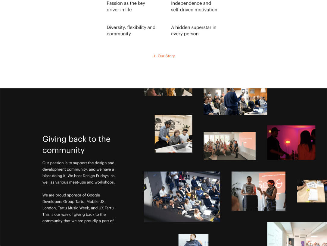
On long layouts, like our website, for example, it is allowed to use different themes for different sections interchangeably. That creates more contrast and visual rhythm between the sections.
On long layouts, like our website, for example, it is allowed to use different themes for different sections interchangeably. That creates more contrast and visual rhythm between the sections.


On long layouts, like our website, for example, it is allowed to use different themes for different sections interchangeably. That creates more contrast and visual rhythm between the sections.


To keep the visual style simple, we have only three colours to play with — black and white, plus orange for accents.

Black is a primary content colour.
Black is a primary content colour.


Black is a primary content colour.

White is the background colour.
White is the background colour.


White is the background colour.

Try to be very conservative with the use of the accent orange. In the digital medium, we highlight the primary call-to-actions with it. Usually, only one element in the frame is coloured orange.
The orange colour is a heritage of Mobi Solution’s brand and a bloodline continuation.
Try to be very conservative with the use of the accent orange. In the digital medium, we highlight the primary call-to-actions with it. Usually, only one element in the frame is coloured orange.
The orange colour is a heritage of Mobi Solution’s brand and a bloodline continuation.


Try to be very conservative with the use of the accent orange. In the digital medium, we highlight the primary call-to-actions with it. Usually, only one element in the frame is coloured orange.
The orange colour is a heritage of Mobi Solution’s brand and a bloodline continuation.


Here is defined the use of different shades of Mobi Lab black on various elements for both themes.


