Visas Iespējas, a Latvian startup on a mission to connect job seekers with employers, has deep roots in its market. With several products, like Darbe, across web and mobile platforms aimed at making the job hunt smarter and more accessible, the team was eager to launch new ideas quickly. But without a unified design approach, maintaining brand consistency and scaling efficiently had become an increasing challenge.
The company faced several critical challenges: a fragmented UI, misalignment between designers and developers, and an unstructured visual language that led to excessive one-off elements and an issues like “67 different shades of grey”. With an undefined product ownership structure, a junior team, and growing platform diversity, there was a real risk of design debt slowing down innovation. On top of that, the handoff between design and development was becoming time-consuming and error-prone.
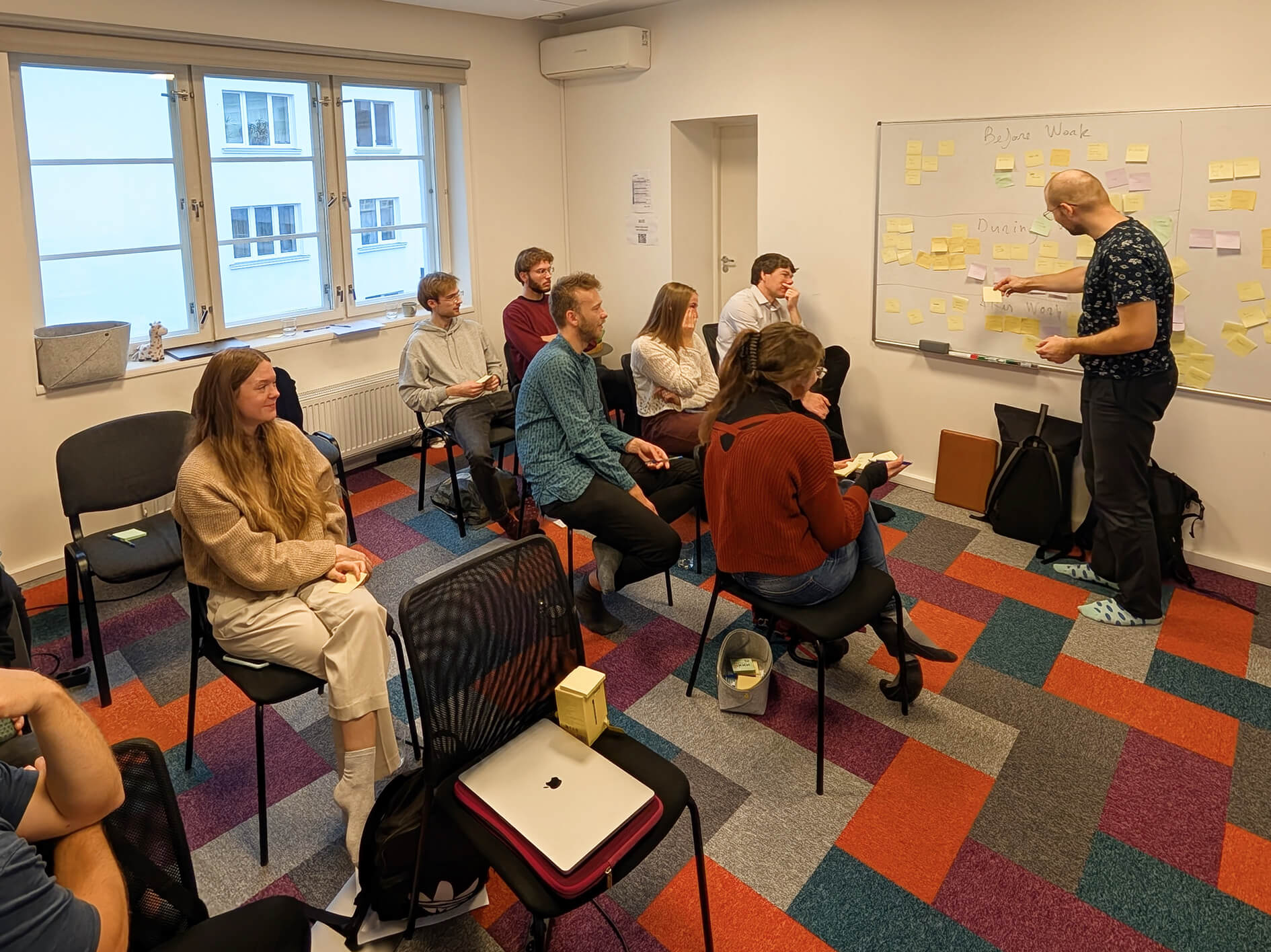
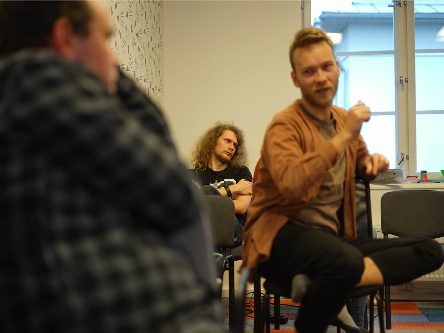
To tackle these issues, we formed a cross-functional team combining talent from both Visas Iespējas and Mobi Lab. This included Visas Iespējas’ lead designer, development lead, engineers, product owner, and CEO working closely with Mobi Lab’s product designer, CTO, and engineers across Android and iOS platforms. The team was ideally positioned to bridge the gap between business, design, and engineering, setting the stage to follow through with our process.
We started by auditing Visas Iespējas UI and workflows, uncovering inconsistent components, communication gaps, and inefficiencies in design handoff. For that we conducted a full day lasting workshop to understand the client needs, plans and the product through-and-through. All of that was followed by 1-on-1 interviews with all the stakeholders—designer, developer, and tech lead. We found a major inconsistency in using design components (too big sandbox for the designer). Because of some components had missing states, this situation had introduced too many shades of grey. Design and development had lost of track what each of the grey’s were representing. The colour needed a systematic approach, that could be easy to follow when defining disabled and other states. We also found a lack of code ownership. Meaning there was no back-and-forth technical discussion between dev and design to approve new components and many inconsistencies were able to slip through into production.
We decided to address the internal ownership issues first by clearly defining who is responsible for design components, code, and reverse engineering processes to ensure wider adoption.
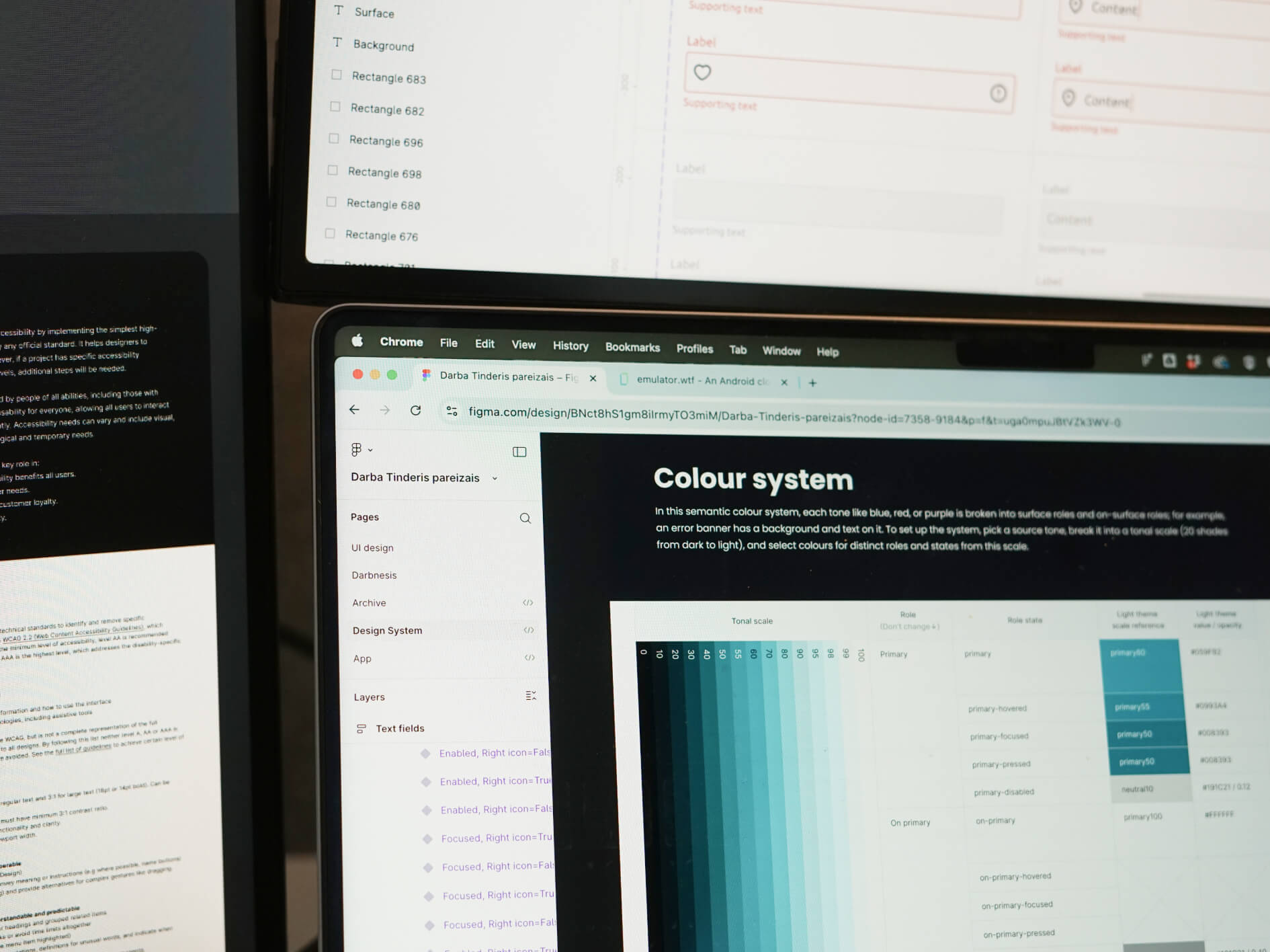
Instead of using a native system, we chose to build a custom design system tailored to their needs—flexible for rapid iteration and consistent across platforms. Darbe uses a web app for job providers to post vacancies and mobile apps (Android and iOS) for job seekers. To ensure a seamless experience across platforms, we based the custom system on Material Design, since Darbe’s existing components already visually resembled Material’s. Before refining components with full functionality and states, we first established the style system foundation, including the colour system, custom iconography, and type and sizing scales. With this in place, we were ready to build the design components and their code equivalents.
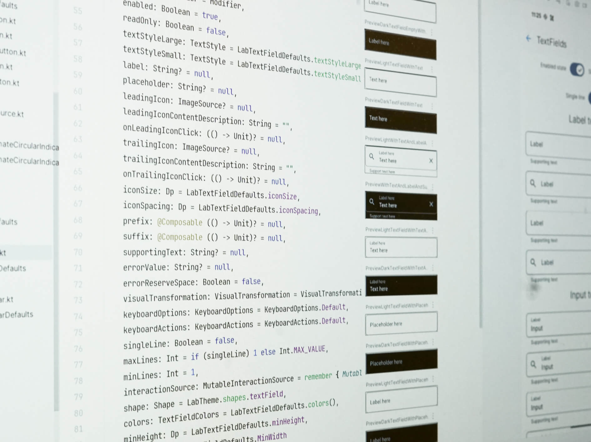
Components were designed in Figma and built in code, with weekly check-ins to stay aligned and address feedback. We began with common elements like buttons (in various sizes), input fields, and controls. The audit showed that vacancy cards and alert handling needed extra focus, so we created a variety of toasts and cards to cover all use cases.
We finished the project by setting up clear maintenance processes that helped the internal team manage the design system on their own as the product grows. This involved setting up regular meetings where designers and developers review progress, discuss new component needs, and share feedback. These ongoing efforts ensure the system stays up to date, consistent, and well-equipped to support future development.
Eesmärgiga võimaldada kasutajatel alustada parkimist võimalikult väheste sammudega, tegime konto loomise vabatahtlikuks. Sageli on parkimisteenused turistidele vähem kasutajasõbralikud, kuid Parkner võimaldab kiiresti uues kohas parkida ilma konto loomiseta.
Another hurdle was the sheer freedom available in the design environment, what we called the oversized sandbox. Naturally, creative minds explore every possibility when given the chance, but this led to a flood of custom components and visual inconsistencies. Our goal was to strike the right balance: build a system flexible enough for experimentation but structured enough to guide consistent, scalable design.
We created a flexible but structured design system with a style guide, UI components, and documentation to align teams, reduce inconsistencies, and support both creativity and consistency across platforms.
The Design system was divided into 3 sections—a style guide, UI components and finally documentation. All of that was coupled with the process of contributing back to the system.
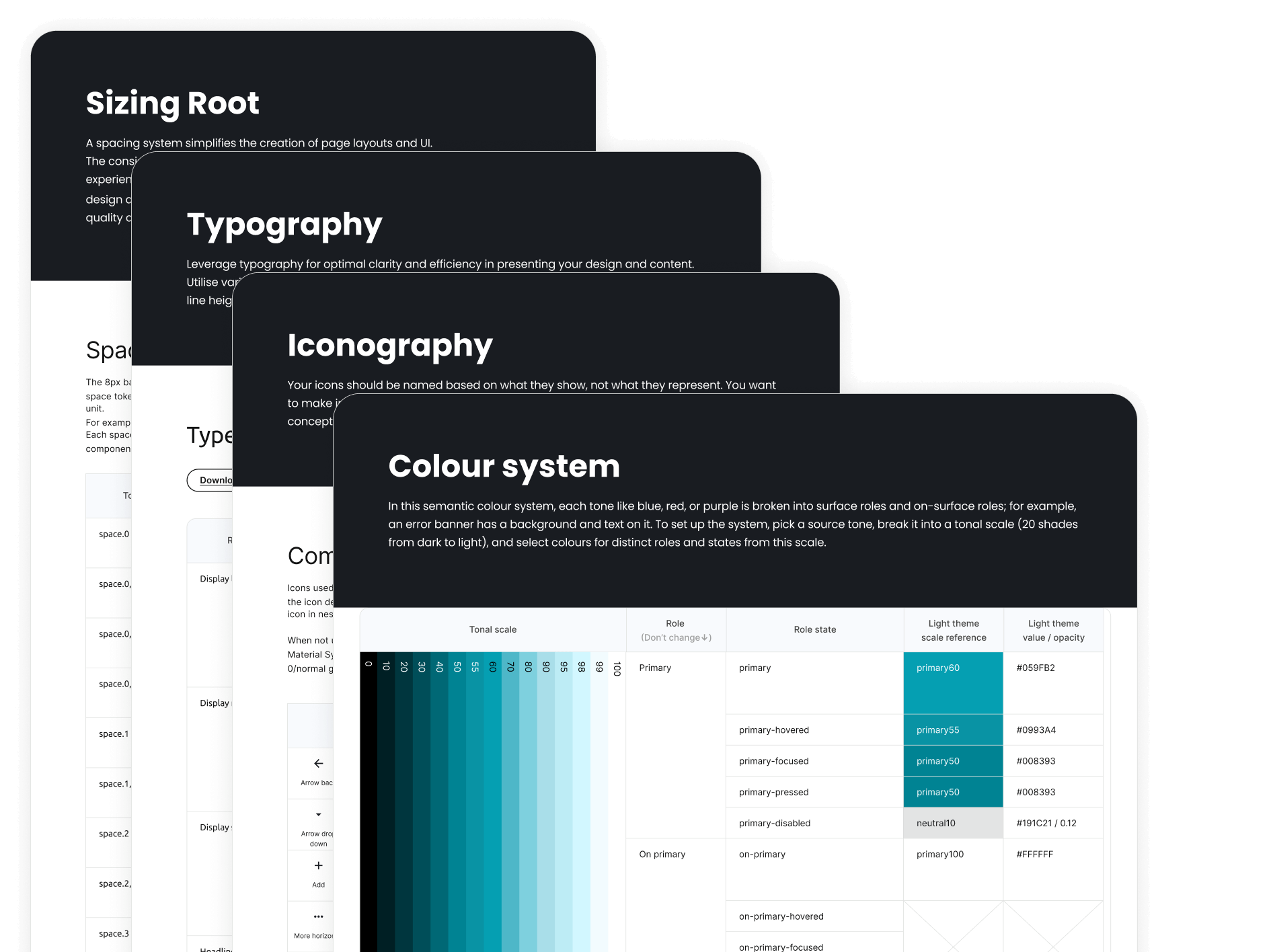
Style guide’s main goal was to carry the consistent brand feel throughout all the products and platforms. When creating the colour system we knew we wanted to use semantic token system and therefore we separated colours based on hierarchy and use case. For example the most prominent elements that needed to carry the brand message, like a primary button, received the “primary-surface” token and content on top of it the “on-primary-surface”. As a minimum beside the primary palette we needed secondary, tertiary, RAG and two neutral palettes to have the sweet spot between flexibility and not getting overwhelmed. With the type scale we went with the approach to setup 15 different sizes that we used for both web and mobile applications. Again it gave us enough flexibility but kept us away from the ever creeping amount of type styles. Sizing system uses 4px grid. Icon library uses mostly material symbols with an exceptions for icons that are very specific for the Visas Iespējas products.)
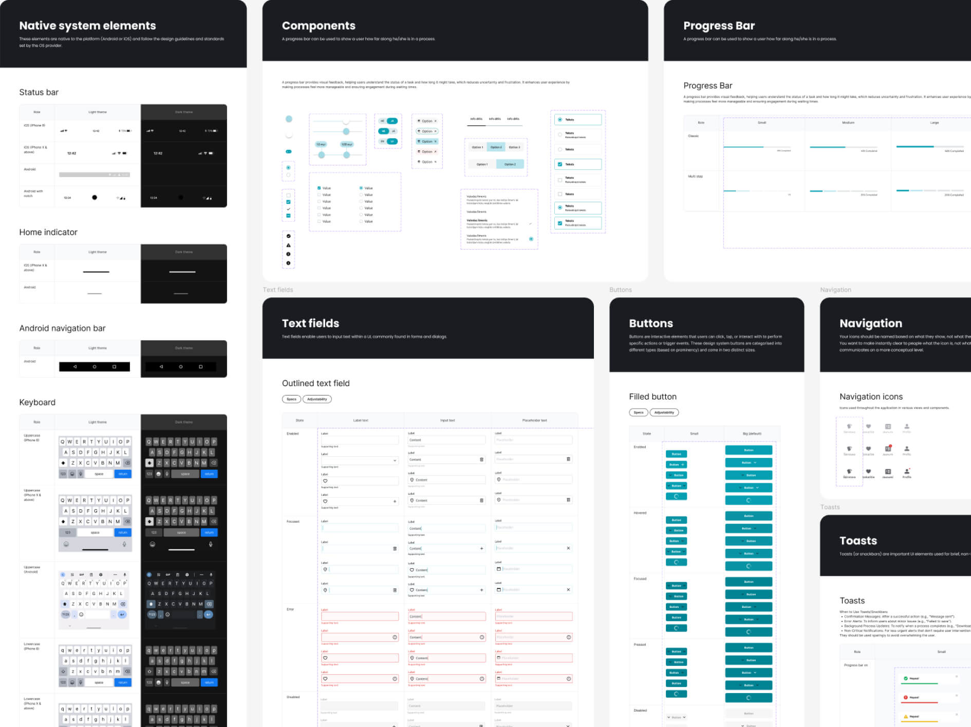
For the MVP we created 25 different Figma UI components. Starting from the most used ones like buttons and inputs and finishing off with more complex components like vacancy cards. Here is the list of all the components we needed for the initial experience:
While product development continued, we gradually introduced the new design system components into live views and flows, replacing any that didn’t meet the updated standards. Developers refactored front-end code to replace old components with systemised ones, updated styling to align with the new token-based system, and ensured component behaviour matched design specs. Shared UI libraries were updated and extended, enabling smoother integration and consistency across platforms.
We established a contribution process to keep the design system evolving over time. The design system team holds regular feedback meetings, typically sparked by the introduction of new components. Functionality is reviewed with developers, and once agreed upon, the component is added to the code library. To ensure relevance and avoid clutter, not every new component is added immediately. Instead, design leads adoption. When a proposed component is used in at least three different contexts, it triggers a review meeting with all stakeholders for discussion and potential inclusion.
Following the rollout of the new design system, we focused on measuring performance, consistency, efficiency, and collaboration to show its tangible business benefits. Here are the results in numbers.

The whole project helped our team level up. After years of going with the flow, we now follow a structured process in both development and design. Now it's clear, not guesswork. We iterate instead of reworking.


It was more than just an experience. It was a journey toward becoming a more professional, agile, and aligned team. Along the way, we gained even greater clarity about the true purpose behind everything we do.
The design system is basically LEGO for adults—structured, colourful and designed to make sense. And the best part? I can still be creative—I just don’t have to reinvent the bricks every time I want to build something new.
What started as a scattered design landscape with too many greys, inconsistent components, and tricky handoffs grew into a shared system that supports faster, more confident product development.
By aligning the team around common standards and components, Visas Iespējas overcame misalignment, reduced design debt, and accelerated delivery. Nearly half the UI is now systemised, giving the team a shared language across platforms and products, faster launches, and a much smoother handoff process. It's clear that structure can be a springboard for innovation.
We offer design system consultation to help you set up a scalable, consistent, and maintainable system tailored to your product. Whether you're starting fresh or refining an existing setup, we can support you at every step.